Kato × case study
Unifying design and development through a single system
Replacing fragmented UI libraries with a scalable, AI-enabled design system.
Kato × case study
Replacing fragmented UI libraries with a scalable, AI-enabled design system.
Kato's design and development workflows were split across multiple UI libraries, leading to inconsistency, duplication, and slower iteration.
The goal was to create a single, unified design system that aligned design and engineering, improved consistency, and enabled faster product development, with AI as a first-class part of how the team designs and builds.
Design and development were fragmented:
The result: visual inconsistency, increased development overhead, and friction between design and engineering.
Moved from multiple UI libraries to a single, consistent system based on shadcn/ui: a unified component set, duplication across MUI and Ant Design removed, and alignment between design and implementation ensured.
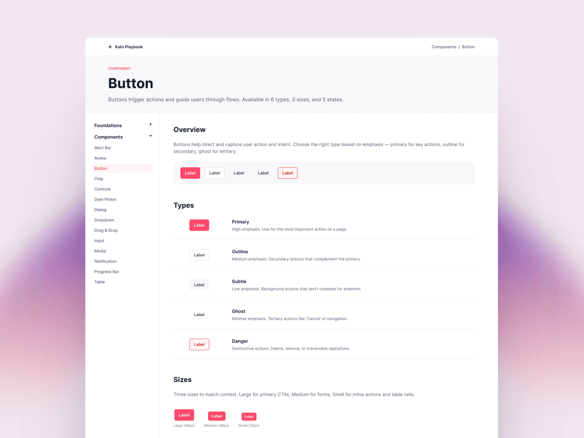
The system's biggest unlock: connecting it to Claude, so the whole product team can design with it, not just designers.
This workflow is how I now operate as both product designer and front-end developer at Kato: the design system keeps AI output consistent, and AI keeps design and build moving at the same speed.
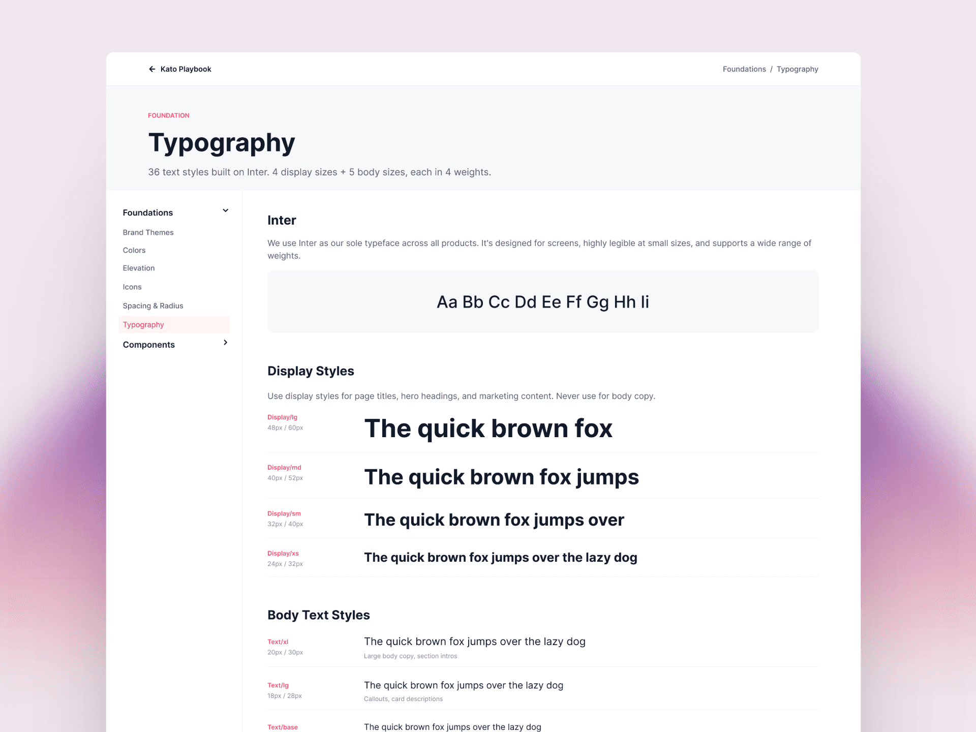
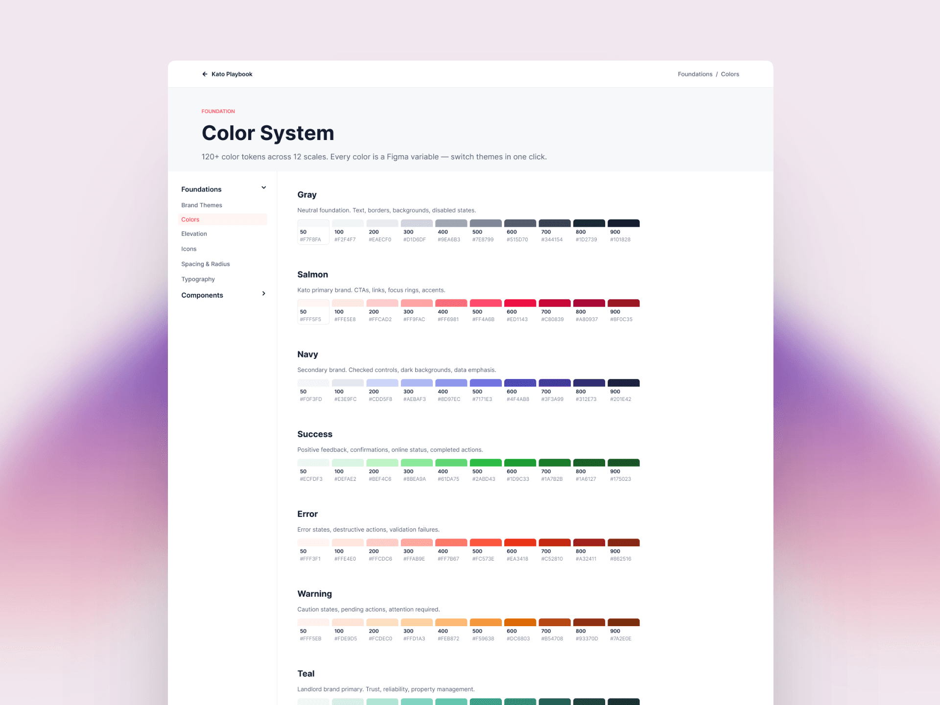
A structured foundation layer in Figma (colour system, typography scale, spacing and layout rules, border radius and component styling) built on variables to ensure consistency, enable easy updates and scaling, and maintain alignment with development.
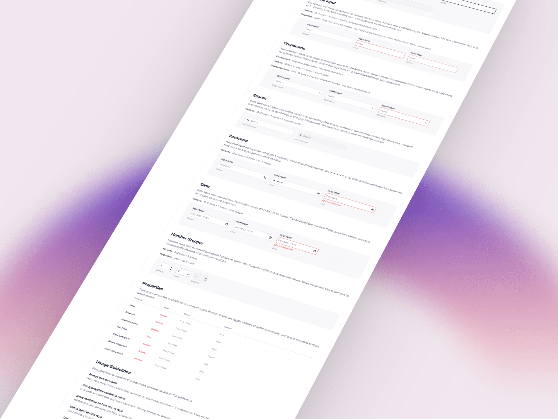
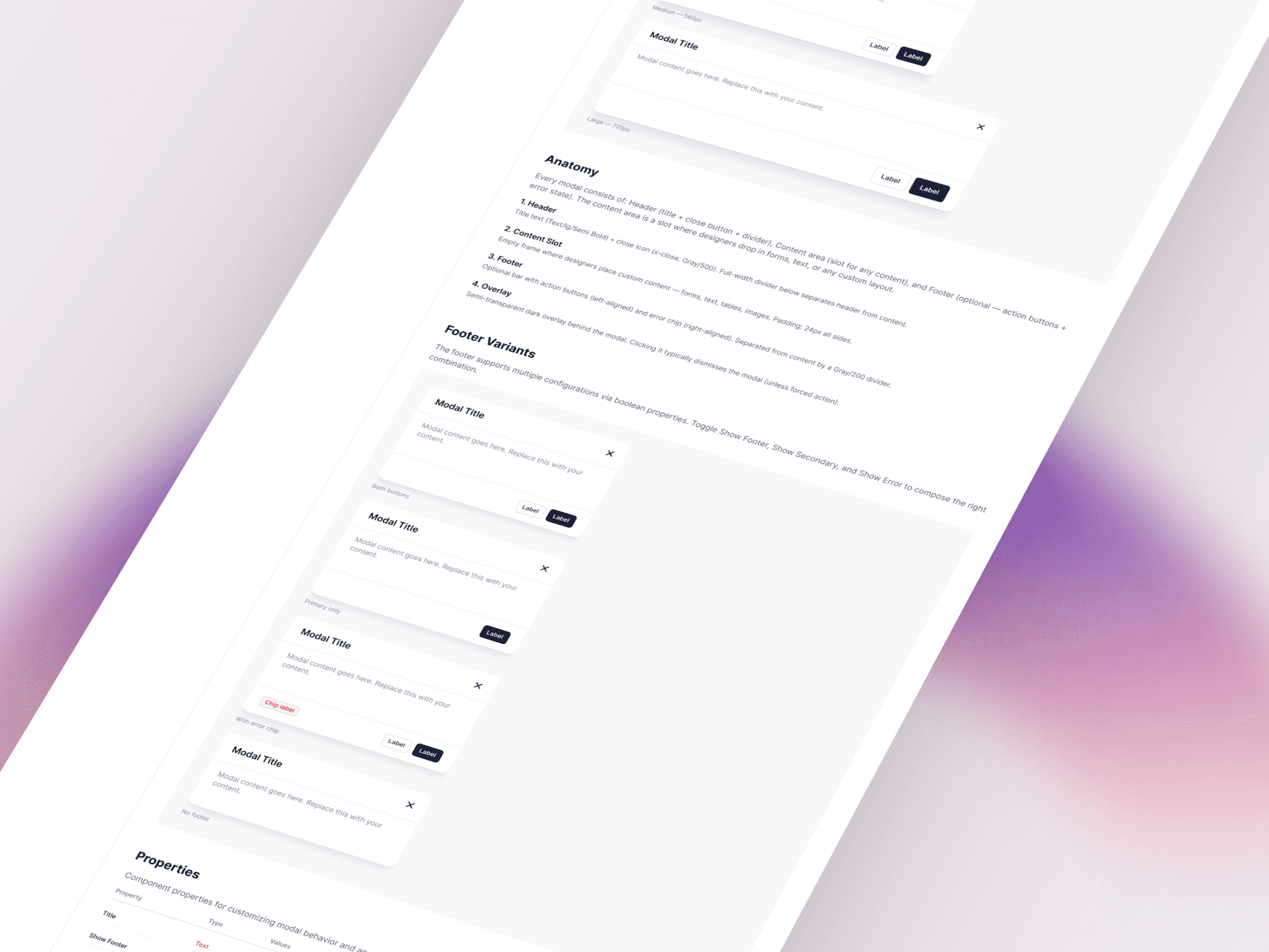
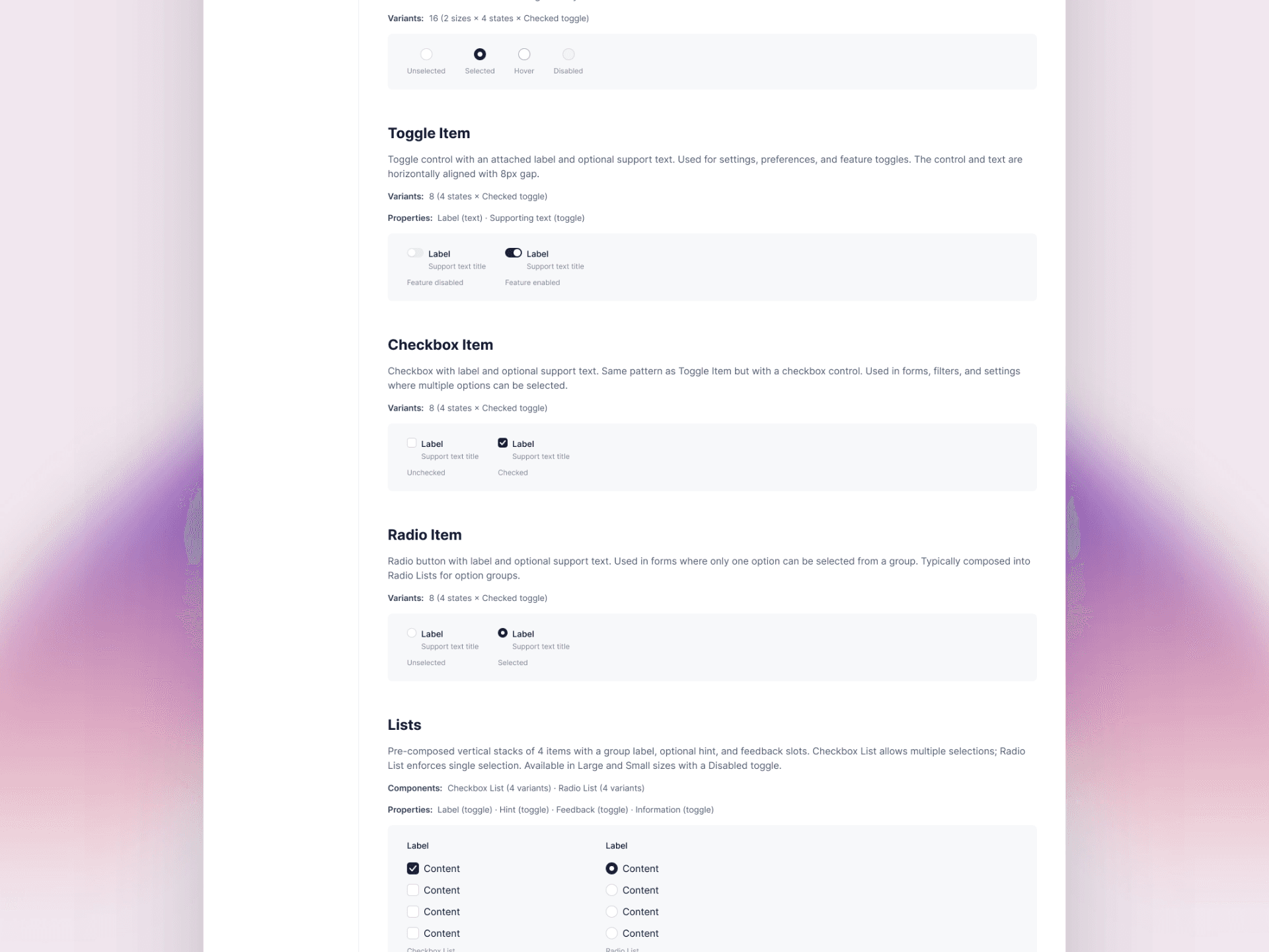
A comprehensive component library covering all core UI components with full state definitions (default, hover, active, disabled, error) and clear interaction patterns, supported by an interactive documentation site and visual references for how components behave in context. Designers move faster; engineers implement with confidence.
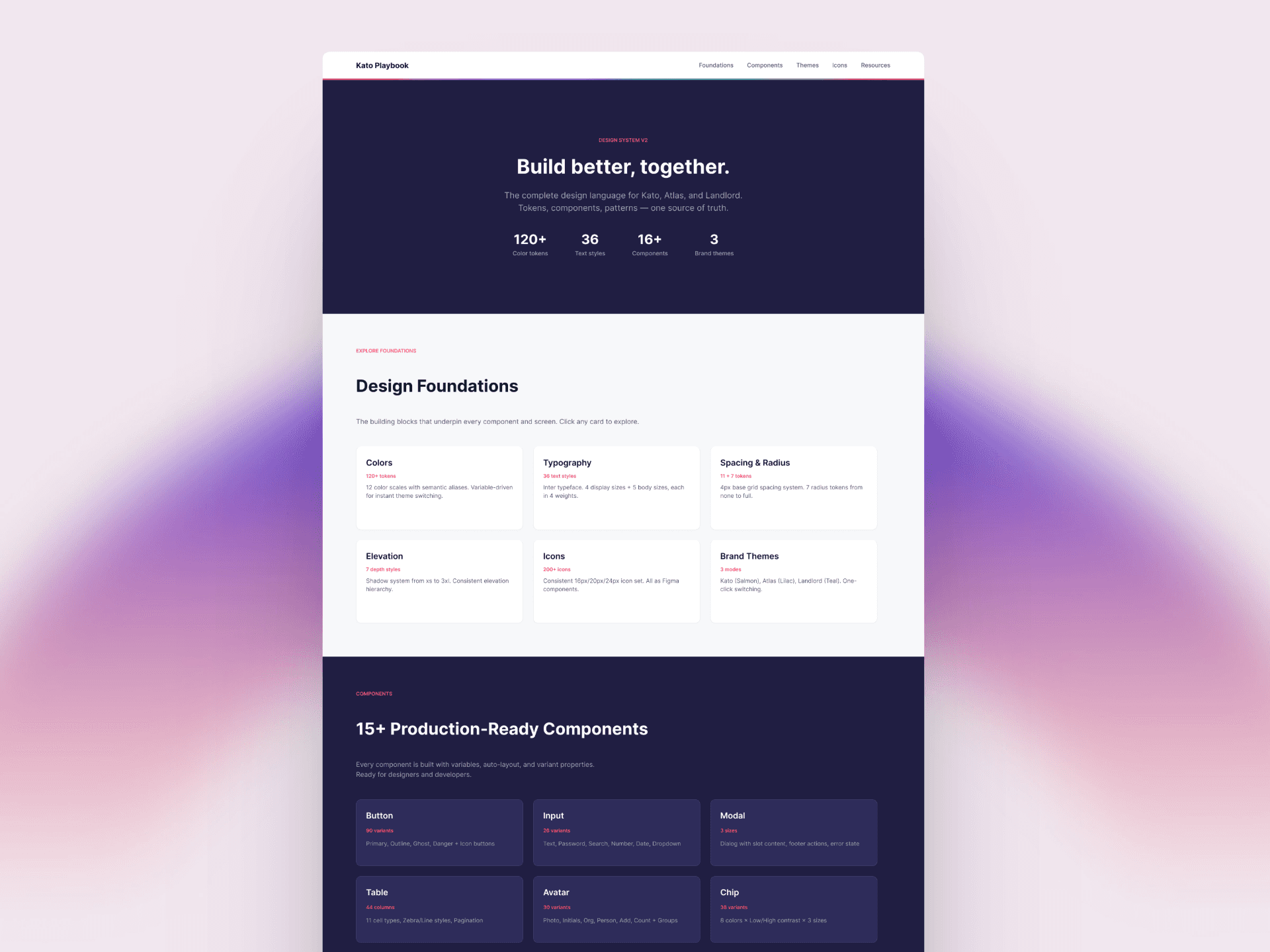
A working, interactive site showing all foundations and components in one place, with clear guidance on usage and behaviour: a shared reference point across teams. The goal: make the system easy to understand and actually used.